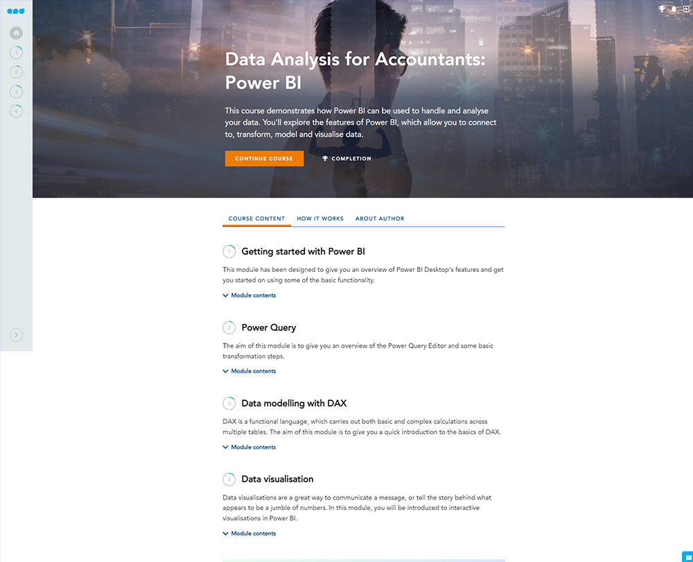
Data Analysis for Accountants: Power BI
This course introduces you to Power BI, Microsoft's powerful data analysis tool, and how it can benefit you in your finance role. Transform the way you handle and analyse data, creating a range of interactive data visualisations.
This course will enable you to
- Use Power BI's "Power Query" to connect to and transform your data into a useable format
- Gain a deeper understanding of DAX (the language used in Power Pivot Excel)
- Build on your ability to analyse data and learn to spot trends and patterns
- Tell the story of your data using Power BI's data visualisations
About the course
Power BI is a self-service business intelligence package from Microsoft that helps you analyse across data sets and really get behind the numbers. It builds on Excel concepts but enables even more powerful data manipulation. It's a tool that every accountant can benefit from.
This course gives you an introduction into Power BI and helps you to develop the skills you need to handle and organise your data beyond what's possible in Excel. You'll explore the features of Power BI, which allow you to connect to, transform, model data. Gain an understanding of the data visualisations available in power BI that enable you to tell a story with your data.
Microsoft Power BI is currently only available for Windows. This course may not be suitable for those using Apple Mac.
Look inside

Contents
- Getting started with Power BI
- Power BI Desktop
- Overview of Power BI
- Connecting to and transforming data
- Relationships
- Visualising data
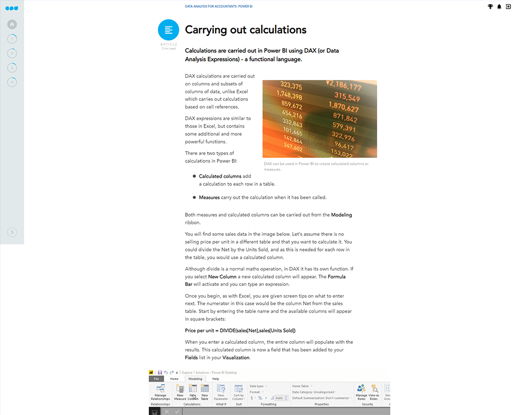
- Carrying out calculations
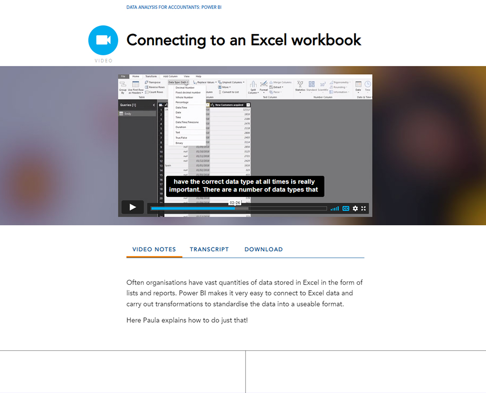
- Power Query
- Power Query Editor
- Connecting to an Excel workbook
- Changing a query
- Connecting to a folder
- Data modelling with DAX
- What is DAX?
- Calculated columns
- Measures
- X expressions
- Related tables
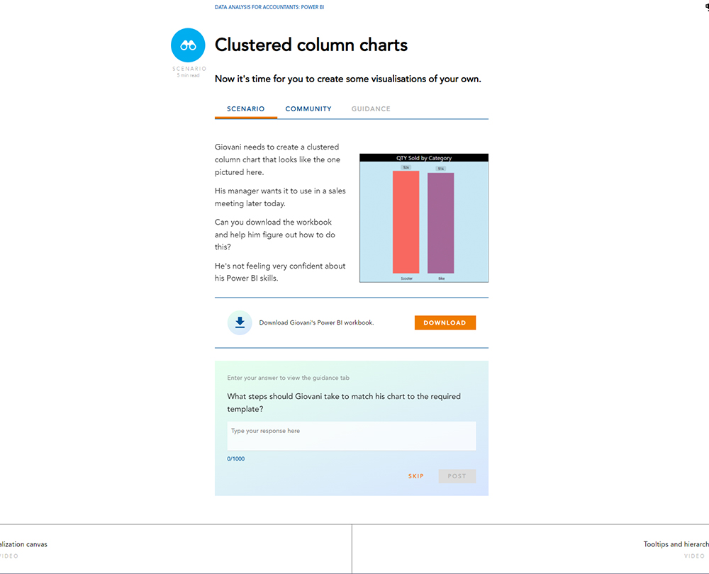
- Data visualisation
- Visualization canvas
- Tooltips and hierarchies
- Slicers and chart interactions
- KPI visualisations
- Choosing the right visualisation
How it works
Author

Reviews
You might also like
Take a look at some of our bestselling courses