
Excel is a firm favourite with accountants. It�s a powerful tool for tracking financial data, creating reports, and making predictions. It�s easy to use and its affordability means its firmly embedded in many small and large businesses.
But are you making the most of it when it comes to financial reporting?
Tables are the perfect choice when you want to share precise values. They allow all your data to be visible to whatever accuracy you choose. They can also be useful when communicating with diverse groups who may want to interrogate your data in different ways. People can use slicers as interactive filter controls to focus on what is important to them.
Graphs and charts should be used when you want to highlight a pattern or trend. Effective data visualisations will display and tell the story of your data, helping you to convey the key points of a data set as quickly as possible.
Column charts allow quick comparisons, line charts highlight trends, and pie charts display relative proportions.
There are some less well-known charts that can confuse users, so let�s take a quick look at some of those now:
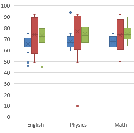
- A
box and whisker chart displays the distribution of a set of data, highlighting five key
statistics: the minimum value (the top whisker), the first quartile, the
median, the third quartile (all shown in the box), and the maximum value
(the bottom whisker). They are good for comparing multiple data sets from
independent sources that are related to one another. For example, management
accountants may want to compare the variation in sales figures across
different products or regions.
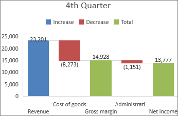
- Waterfall charts show how the starting value of something (say, a bank account balance at the
beginning of the month) reaches the end value (the balance at the month
end), as values are added or subtracted (payments come in or leave the
account). These can be used to track cash flow over time, for example.
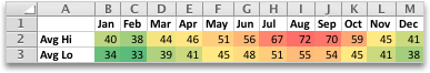
- A
heat map is a chart that uses colour-coding (e.g. different colours or depth and tone
of colour) to display different values, highlighting any disparity between
those values. So, that makes them great for quickly comparing revenue or
profits over months or years.
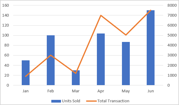
- Combination charts show different chart types (each displaying a different set of information)
on the same chart, e.g. a line and a bar chart. These are useful to visually
highlight the relationship between independent but related sets of data in
one place, for example, to show revenue compared with your targets.
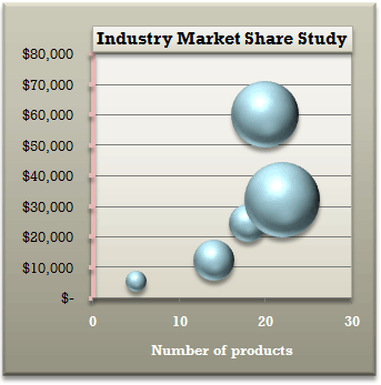
- A
bubble chart is a development of the scatter chart (which visualises the correlation
between values on the X axis and values on the Y axis). Bubble charts allow
you to add a third, and even fourth category of values into the mix! They
can tell the story of different variables that are related to one another -
but they are tricky to get right.
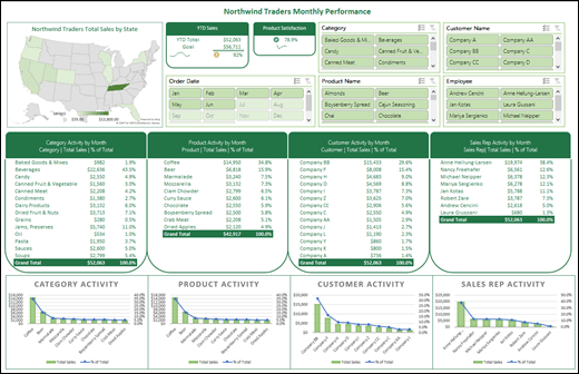
- Finally we have
Excel dashboardswhich present charts and graphs summarising critical performance
information, all in one place. The visualisations should help users to
quickly access and understand raw data on key performance areas, to help
them make effective business decisions. An Excel dashboard can be a very
effective tool when it comes to tracking KPIs, comparing data points, and
getting views over different time periods, to help management make
decisions.
You can check out all of our verifiable CPD on Excel here!
You need to sign in or register before you can add a contribution.