This course will enable you to
- Explore how misguided assumptions and certain presentation methods can lead to incorrect conclusions about performance data.
- Consider the characteristics of "good" data analysis and presentation.
- Develop skills in data presentation to ensure you reach the correct conclusions about performance data.
- Build confidence in your data analysis and presentation skills to utilise data and manage performance more effectively.
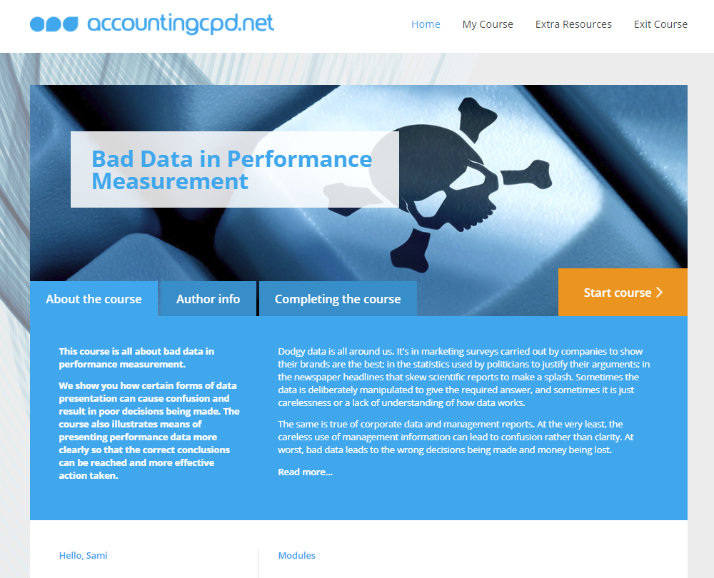
About the course
Dodgy data is all around us. From marketing surveys carried out by companies to show their brands are the best to newspaper headlines that skew scientific reports to make a splash. Sometimes the data is deliberately manipulated to give the required answer, and sometimes it is just carelessness or a lack of understanding of how data works.
The same is true of corporate data and management reports. At the very least, the careless use of management information can lead to confusion rather than clarity. At worst, bad data leads to the wrong decisions being made and money being lost. This course illustrates how performance data can be presented and analysed so that the correct conclusions can be reached and more effective action taken.
Look inside


Contents
- Wrong assumptions
- What are the foundations of bad data?
- What wrong assumptions do we make?
- Why do we assume we know the answer?
- Why do we assume cause and effect?
- What are the problems with targets?
- What are the problems with ranking performance?
- Confusing data presentation
- What types of data presentation can cause confusion?
- What's the problem with using single-point comparisons?
- Why aren't Red, Amber, Green displays useful?
- What are the risks of using ratios and percentages?
- What are the problems with averages and rolling averages?
- Why aren't pie charts useful for measuring performance?
- Why should we avoid using spider diagrams?
- How can too much or too little data cause confusion?
- How can measuring productivity drive bad data?
- Effective data presentation
- What are the principles of good data analysis?
- What are the tools of clean data?
- What is a run chart?
- What does a control chart show?
- What can a control chart tell us about variation?
- How do we construct a control chart?
- How should we express percentages and ratios?
- What is the Pareto chart?
- What do histograms show?
- How do these tools aid effective performance analysis?
- Using data to improve performance
- How do we analyse performance data?
- How do we monitor cost control?
- How do we improve cost control?
- What is the structure for performance management?
How it works
Author

Reviews
You might also like
Take a look at some of our bestselling courses